Color Board in Interior Design: What It Is & How to Use
What is a color board in interior design?
A color board (also called a color mood board) is a visual reference that collects your key colors in one place so you can see how they work together before committing to paint, furniture, or décor. It typically includes paint swatches, fabric samples, finishes (like brass, black metal, or wood tones), and sometimes images that represent the feeling you want in the room.
Unlike choosing colors one-by-one in a store aisle, a color board lets you evaluate the whole palette at once—how warm and cool tones interact, how light or dark the overall look feels, and whether the accent colors actually “pop” the way you want them to under your home’s lighting.
How a color board helps you design a cohesive space
Interior design decisions stack up quickly: wall color, flooring, textiles, art, and even the undertone of a sofa can push a room toward calm and airy or bold and dramatic. A color board helps you set a clear direction early so later choices stay consistent. This is especially useful when styling multiple rooms that need to flow together rather than feel like separate projects.
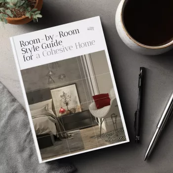
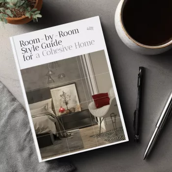
For a room-by-room approach to keeping your palette consistent throughout your home, visit this cohesive style guide.
What to include on a color board
A strong color board usually has a simple hierarchy:
- Base color: the main neutral or wall color that anchors the room
- Secondary colors: supporting tones for large pieces like rugs, sofas, or curtains
- Accent colors: smaller hits for pillows, art, vases, or an accent chair
- Materials and finishes: wood tone, metal finish, stone, tile, leather, or boucle
Viewing these together makes it easier to spot clashes (like two “whites” with different undertones) and to confirm balance (enough contrast, not too many competing statements).
Tips for using a color board effectively
- Check samples in the room’s natural and evening light; colors can shift dramatically.
- Limit the palette to a few repeatable tones for a cleaner, more intentional look.
- Bring the board when shopping to compare items against your established colors and finishes.
FAQ
What’s the difference between a mood board and a color board?
A mood board captures the overall vibe—colors, textures, shapes, and inspiration images—while a color board focuses specifically on the color palette and how those exact tones coordinate.










Leave a comment