Good Interior Design Board Essentials: Purpose to Details
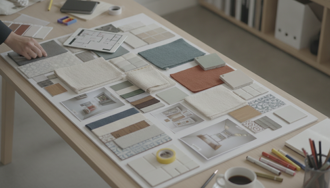
What makes up a good interior design board?
A good interior design board is a single, easy-to-scan snapshot of how a space will look and feel once everything comes together. It goes beyond “pretty pictures” by setting clear direction for color, materials, furniture, lighting, and finishing details—so decisions stay consistent from the first purchase to the final styling.
1) A defined purpose and room context
Start with the basics: which room it’s for, who uses it, and what it needs to do. A design board for a busy family entryway will prioritize durable surfaces and smart storage, while a bedroom board may focus on softness, layered lighting, and calm colors.
2) A cohesive color palette
Strong boards typically include a tight palette: 1–2 main colors, 1–2 supporting tones, and a small set of accents. Showing paint swatches (or close equivalents) alongside textiles and finishes helps prevent mismatched undertones and keeps the room feeling intentional.
3) Material and texture variety
Texture is what makes a board feel “real.” Include key materials like wood tones, metals, stone, glass, and upholstery. Mixing finishes—such as warm oak with matte black hardware or brushed brass—creates depth while still supporting a unified look.
4) Key anchor pieces and supporting items
Identify the big-ticket anchors first (sofa, bed, dining table, rug) and then add supporting pieces (side tables, chairs, curtains). A good board also shows scale cues—like rug size or table proportions—so the room doesn’t end up feeling cramped or sparse.
5) Lighting and “final layer” details
Include at least one statement light and one practical light source, plus finishing touches like art, pillows, greenery, and decorative objects. These items tie the palette together and help the space feel complete rather than staged.
For a helpful framework on making every room feel connected, visit this room-by-room style guide and use the same cohesive principles when building your board.
FAQ
How do you make a room feel cohesive without matching everything?
Repeat a few core elements—like a consistent wood tone, metal finish, or color family—while varying shapes and textures. Cohesion comes from shared cues, not identical pieces.











Leave a comment